Responsive settings
Since 9.2
Starting from version 9.2 WPBakery Page Builder allows you to set styles for each device separately, hide elements on selected devices and change the screen width where each device view starts.
Device views
| Device | Screen width (default) | Editor preview (default) |
|---|---|---|
| Desktop | From 1200px | Full width |
| Tablet horizontal | Up to 1200px | 1024px |
| Tablet vertical | Up to 1024px | 768px |
| Mobile horizontal | Up to 768px | 640px |
| Mobile vertical | Up to 640px | 480px |
Screen widths and preview sizes are set by the breakpoints in the plugin settings: each device view starts at its breakpoint, ends at the next one and the editors preview it at its breakpoint width. Mobile vertical covers everything below the mobile horizontal breakpoint and is previewed at 480px, or narrower when that breakpoint is lower.
Breakpoints
The screen width where each device view starts can be changed in WP Dashboard -> WPBakery Page Builder -> Design Options tab:
- Desktop breakpoint (1200px by default);
- Tablet horizontal breakpoint (1024px by default);
- Tablet vertical breakpoint (768px by default);
- Mobile horizontal breakpoint (640px by default).
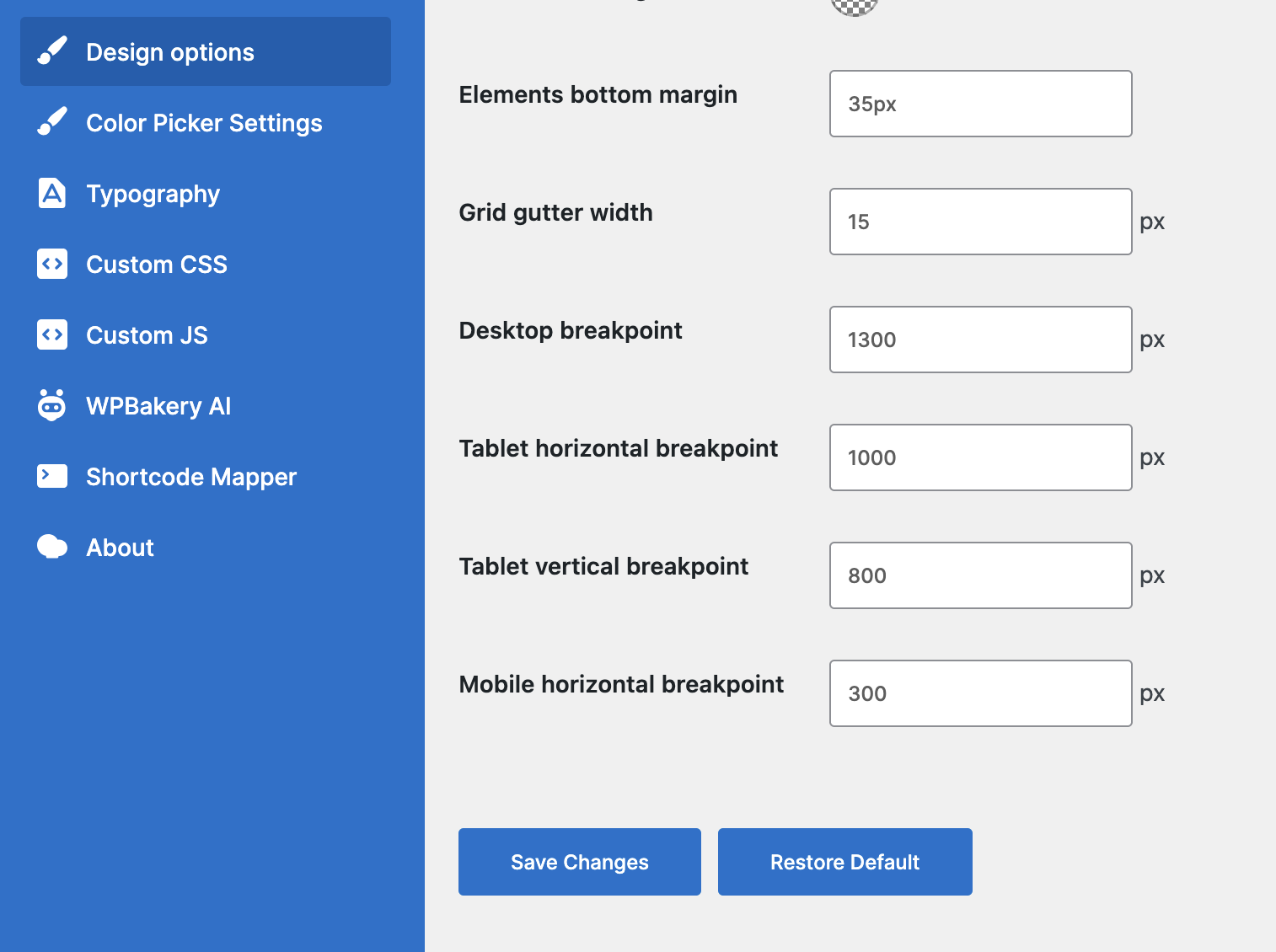
Once saved, the device dropdown in both editors shows the new screen widths and previews each device at its new width.
Note: values must increase from mobile horizontal to desktop. Invalid value is rejected on save and the previous one is kept.
Column widths follow new breakpoints after saving the settings with "Use custom design options" enabled. Breakpoints changed in earlier versions are kept.
Editing per device
Some params can have a different value for each device, for example the ones in the Design Options tab. To set a value for a device, select that device in the device dropdown in the navigation bar, then set the value. The editor previews the page at the width of the selected device. Desktop is selected by default. The same device dropdown is also shown next to each of these params in the element edit window, so you can switch the device there too. Both dropdowns always show the same device.
To remove all device-specific values of an element and return to its Desktop values, use "Restore default responsiveness" in the "Element Settings" menu of the element edit window, available for elements with params that support responsiveness.
Inheritance
A value set for a device is used by that device and all smaller devices, until a smaller device gets its own value. For example, a value set for Tablet horizontal applies to Tablet horizontal, Tablet vertical, Mobile horizontal and Mobile vertical, unless one of them has its own value. A param with no value of its own shows the inherited value as a placeholder, and values set with Desktop selected apply to all devices that have no value of their own.
Hide element
"Hide element" toggle at the top of the Design Options tab hides the element on the selected device and the smaller ones, unless a smaller device is set to visible. With Desktop selected it hides the element on all devices. Element hidden on all devices is not displayed on your site at all. In the editors hidden elements remain visible but dimmed.
Note: "Hide row" and "Hide section" toggles and column hide checkboxes are replaced with "Hide element" toggle. Existing pages keep working, old values are displayed as "Hide element" setting when you open the element edit window.
Column width and offset
Column width and offset are set per device in the column edit window under "Responsiveness" tab, see Column width and offset. To hide a column use "Hide element" toggle in the column Design Options tab.