Dropdown
Type: dropdown
Description
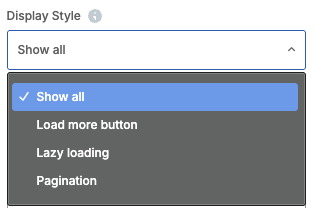
Dropdown select field with predefined options.
Screenshot
Basic Usage
[
    "type" => "dropdown",
    "heading" => __("Field Label", "your-text-domain"),
    "param_name" => "your_param_name",
    "value" => [
        __("Option 1", "your-text-domain") => "value1",
        __("Option 2", "your-text-domain") => "value2",
        __("Option 3", "your-text-domain") => "value3",
    ],
    "std" => "value1", // Default value
    "description" => __("Field description", "your-text-domain"),
]
Common Parameters
All param types support these common parameters:
| Parameter | Type | Description |
|---|---|---|
type | String | Required. Must be "dropdown" |
holder | String | HTML tag name where the value is displayed in backend edit mode. Default: hidden input |
class | String | CSS class added to the holder HTML tag |
heading | String | Label shown in the editor interface |
param_name | String | Required. Parameter name used in shortcode |
value | Mixed | Value for the parameter |
description | String | Help text shown below the field |
group | String | Tab/group name to organize parameters |
section | String | Section slug to visually group params within a tab |
weight | Integer | Display order (higher = shows first) |
edit_field_class | String | CSS class for field width (e.g., "vc_col-sm-6") |
dependency | Array | Show/hide based on other field values |
admin_label | Boolean | Show value in element title bar |
param_holder_class | String | CSS class for the param wrapper in the edit element modal |
save_always | Boolean | Force saving the value even if it equals the default or is empty |
callback | Array | JavaScript function callback (e.g., ['after_add' => 'myCallback']) |
settings | Array | Type-specific configuration options (see Type-Specific Parameters below) |
deprecated | String | Version in which the param was deprecated |
Type-Specific Parameters
| Parameter | Type | Default | Description |
|---|---|---|---|
std | String | - | Default selected value |
settings | Array | - | Configuration array with the following options: |
type | Array | - | Describes specific dropdown variations (used internally with grids) |
search | Boolean | false | Enable search/filter functionality. Recommended for dropdowns with 10+ options |
Complete Example
<?php
add_action('vc_before_init', 'my_element_with_dropdown');
function my_element_with_dropdown() {
    vc_map([
        "name" => __("My Element", "domain"),
        "base" => "my_element",
        "category" => __("My Category", "domain"),
        "params" => [
            [
                "type" => "dropdown",
                "heading" => __("Style", "domain"),
                "param_name" => "style",
                "value" => [
                    __("Default", "domain") => "default",
                    __("Modern", "domain") => "modern",
                    __("Classic", "domain") => "classic",
                ],
                "std" => "default",
                "description" => __("Select element style", "domain"),
                "settings" => ["search" => true], // Enable search for long lists
            ],
        ],
    ]);
}